Construction planning · Mobile-first product design
Wayloader Plan — Simplifying Planning with Mobile-First UX
Product Designer — led discovery, UX strategy, flows, prototyping and usability testing
- Role
- Product Designer
- Timeline
- End-to-end
- Product
- Wayloader Plan
- Tools
- Figma · Maze
Overview
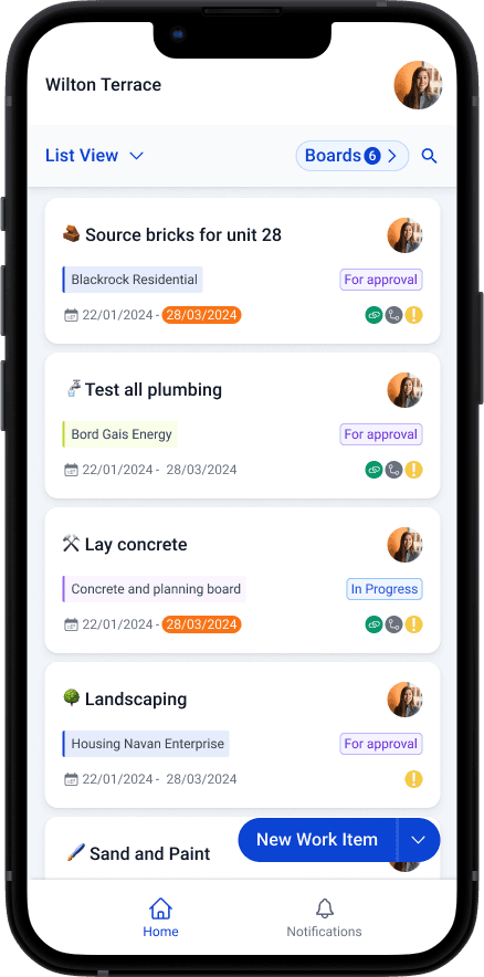
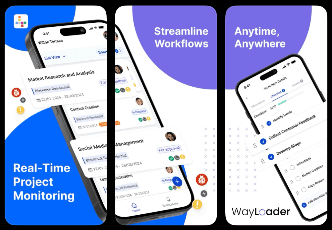
Wayloader Plan is a construction project planning tool for planners and site workers collaborating across complex builds. This project simplified planning workflows, improved visibility across teams and brought the experience into the field through mobile-first design.
I led the design end to end, from early discovery and concept exploration through high-fidelity prototyping and validation.
The problem
Wayloader's web-based tool was not built for on-site use. Construction managers relied on WhatsApp, spreadsheets or memory while moving around a site, leading to missed updates, duplicated work and slow progress tracking.
The brief was to bring core desktop functionality into a mobile format, make it fast under pressure and support both online and offline work.
For the business
- Increase field-team adoption
- Improve deliverable-tracking accuracy
- Reduce support tickets caused by project miscommunication
For users
- View and update tasks on the go
- Track changes and progress in real time
- Stay informed without switching tools or chasing updates
My role & constraints
- Led discovery and UX strategy
- Interviewed planners and site workers
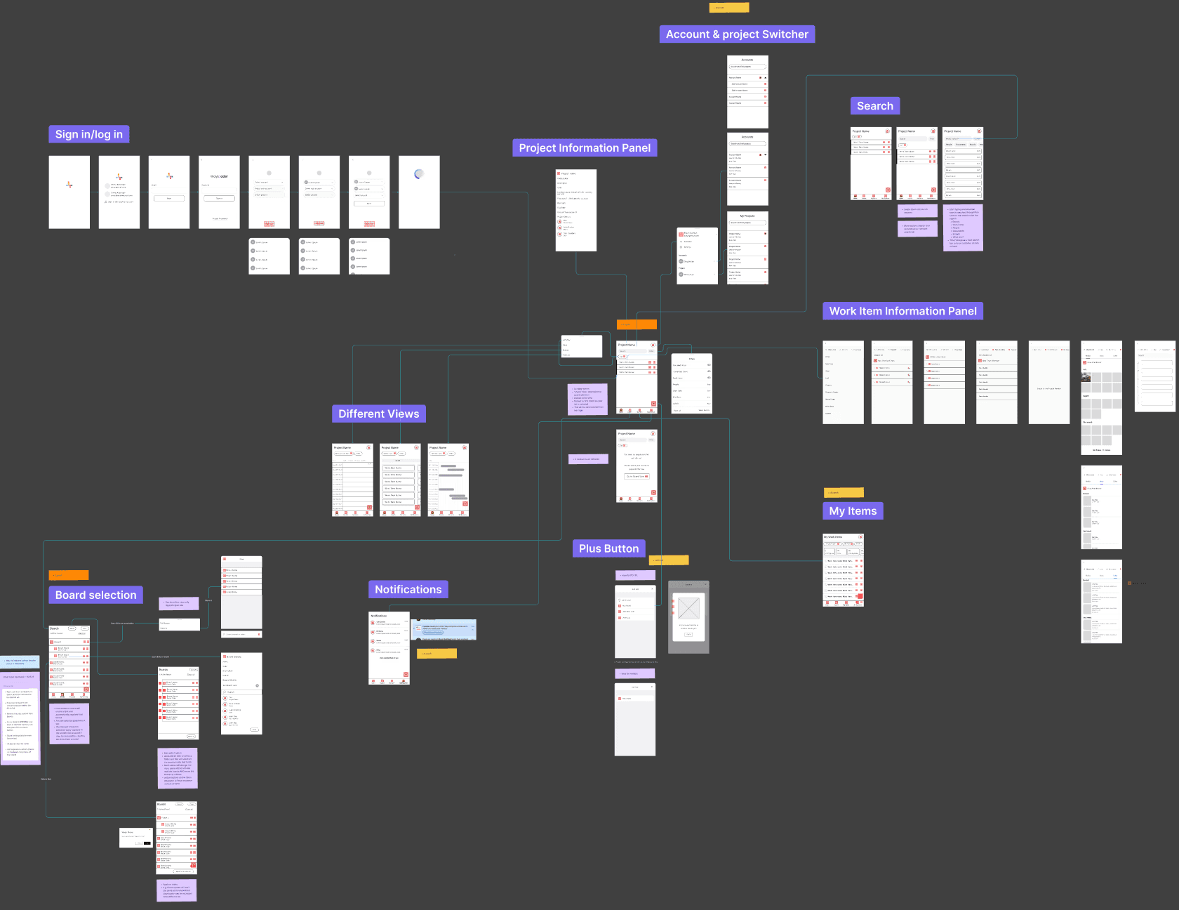
- Designed flows, wireframes and high-fidelity UI
- Built and iterated Figma prototypes
- Partnered with Product Managers and Engineers
- Facilitated usability testing and incorporated feedback
Tools: Figma · Maze
Discovery & research
I combined interviews with construction planners and site workers, workflow mapping across office-to-site handoffs and a heuristic review of the existing planning experience.
Working with the PM, I mapped use cases against effort and impact. The MVP centred on task list, timeline and map views; create, update and submit actions; and filtering by site, assignee or due date.
Key insights
Site workers needed fast, glanceable access to plans and updates on mobile.
Planners needed clear visibility into progress and field changes.
The handoff between planning and execution—not a missing feature—was the central source of friction.
Design approach
Role-aware structure
Tailored views to planners and site workers without carrying desktop complexity onto a smaller screen.
Mobile-first collaboration
Designed quick updates, checks and communication around the conditions of field work.
Flatten the hierarchy
Grouped tasks by date and project, with four clear areas: Plan, Projects, Tasks and Profile.
Iterate early
Moved from sketches to clickable wireframes and tested hierarchy and language before visual polish.
The solution
Timeline view
A Gantt-style plan adapted to mobile with horizontal scrolling.
Task cards
Glanceable status, deadlines and quick actions for use under pressure.
Map view
Project locations overlaid with task data to preserve context.
Offline sync
A visible sync state, manual option, confirmations and fallback errors for unreliable connectivity.
What changed through testing
People were confused by the ‘Review’ status.
Clarified the naming and paired it with more legible iconography.Tasks did not communicate urgency.
Added smart tags such as ‘Due Today’ and supporting colour cues.There was no feedback after syncing.
Introduced confirmation and error fallback states.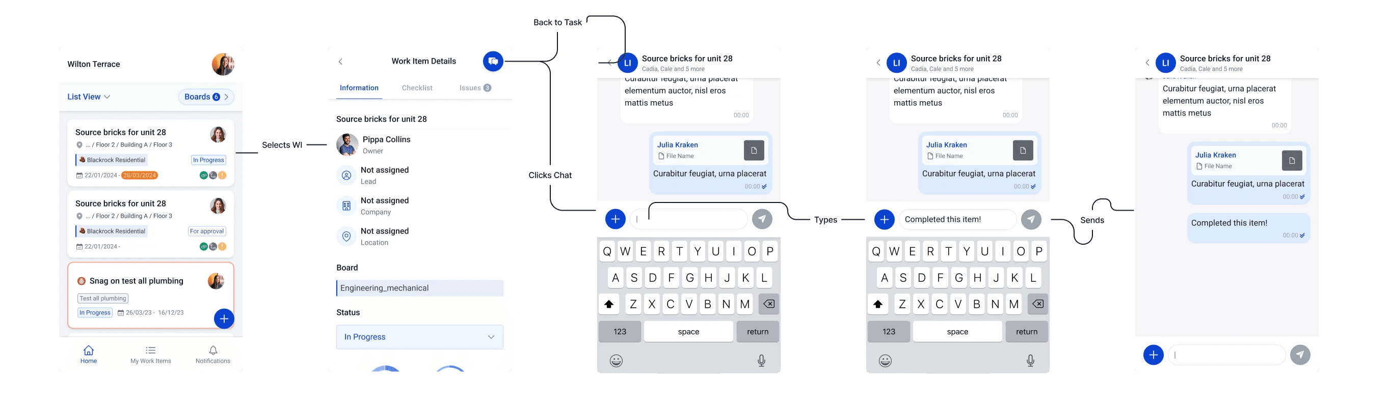
Outcome & impact
01
+60% field-team adoption in the pilot rollout.
02
Admin time reduced by approximately 35% through simplified reporting.
03
Fewer missed tasks and better coordination on large sites.
04
The designs were validated and approved to inform future collaborative planning features.
Reflection
The strongest decision was not shrinking the web product. It was rebuilding the hierarchy around what someone needs while standing on site.
Offline-first is a UX problem too
Sync state, errors and fallbacks need to be visible and understandable.
Design with urgency in mind
Site teams are completing actions under pressure, not browsing.
Simple does not mean basic
Removing interface weight required preserving value while reducing friction.