Brand and product system · Construction software suite
Wayloader Re-Brand
Senior Product Designer — visual and brand systems lead
- Role
- Senior Product Designer
- Timeline
- System-wide
- Product
- Wayloader suite
- Tools
- Figma

Overview
This initiative defined a cohesive visual identity for a suite used by project planners and site teams. The work connected product strategy, brand foundations and a scalable interface language.
I led the effort end to end, from audit and alignment through visual-system definition and application across product touchpoints.
The problem
The suite lacked a unified visual identity. Inconsistent modules made switching tools harder, complicated component reuse and weakened perceived quality and trust.
Plan used colours from other modules and appeared to be the parent brand; its visual language also felt pharmaceutical and too narrowly tied to construction.
My role & constraints
- Defined visual identity principles
- Designed core brand elements and interface language
- Created reusable design tokens and components
- Ran stakeholder workshops and preference testing
- Integrated the brand into product workflows
- Partnered with Product and Engineering
Discovery & research
I audited the product suite, reviewed category conventions and ran workshops to define brand values.
Competitive analysis and visual preference testing connected aesthetic decisions to orientation, reliability and trust—not personal taste.
Key insights
Users associated visual clarity with tool reliability.
Consistency across modules reduced the need to reorient.
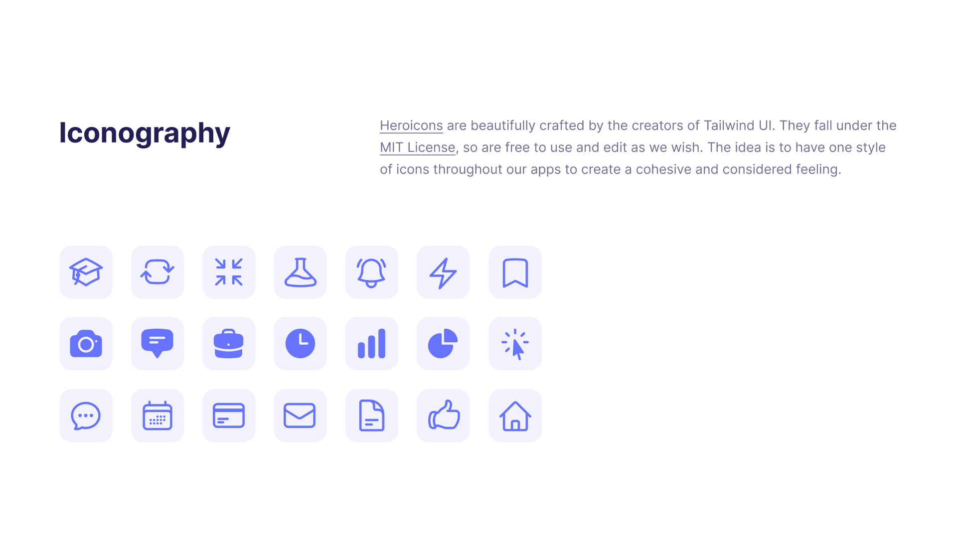
FontAwesome’s generic, inconsistently sized icons weakened recognition and identity.
Roboto felt mechanical and generic, with cramped small-size legibility in this interface.
Design approach
Define foundations
Built a concentrated palette, type scale and visual grammar for readability, accessibility and use in light and dark contexts.
Balance the suite
Created distinct but related module identities so Plan no longer looked like the parent product.
Build a modular system
Translated the identity into tokens and reusable Figma components.
Validate in context
Applied foundations to real workflows to test hierarchy, consistency and user perception.
The solution
Module identity
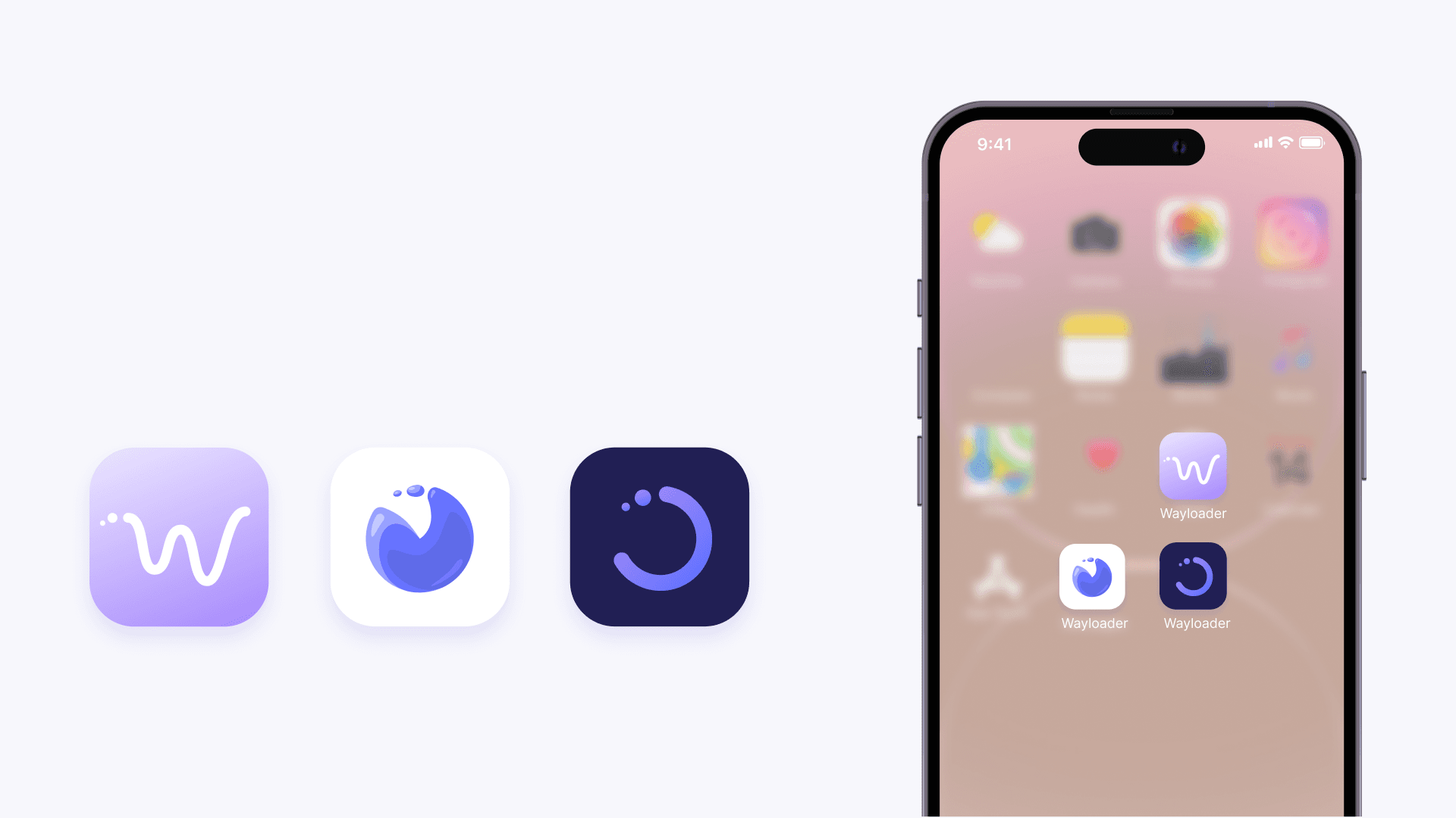
A cohesive logo family with concentrated colours and enough flexibility to work beyond construction.
Custom iconography
Consistent proportions, line weight and product-specific meaning replaced a patchwork of generic symbols.
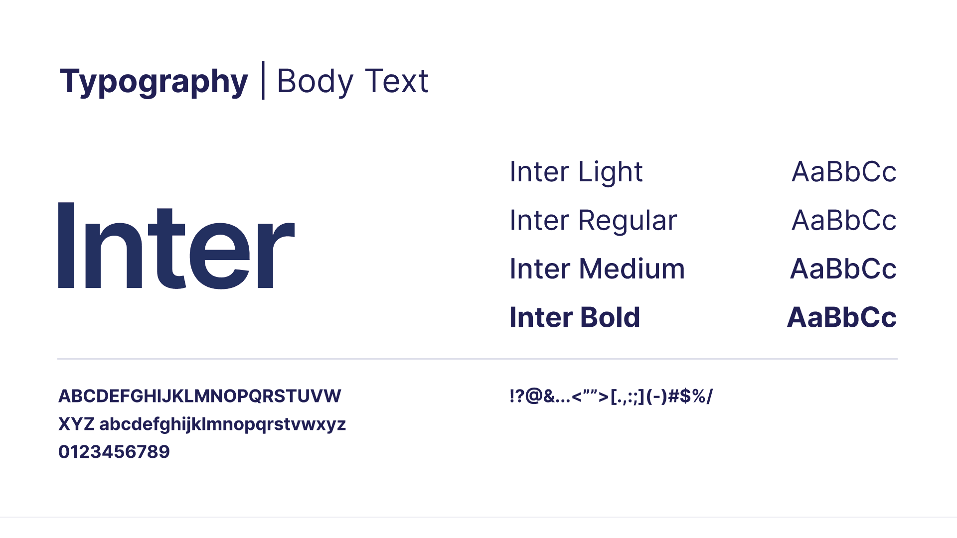
Inter for UI
Chosen for screen legibility, balanced spacing and consistency across interface weights.
HK Grotesk for display
Added a stronger, friendlier brand voice while preserving a clear hierarchy with Inter.
Outcome & impact
01
Improved visual consistency across modules.
02
Faster onboarding for new designers and developers.
03
Reduced UI rework through reusable components and decisions.
04
Higher perceived product quality in internal testing and stronger stakeholder confidence in future consistency.
Reflection
The rebrand became useful when it stopped being a presentation and became a system people could make product decisions with.
Where I’d take it next
- Brand-led motion patterns
- Visual feedback tied to task success
- A deeper tone-of-voice system across product communications