Construction planning · Contextual and spatial UX
Wayloader Locations
Senior Product Designer — feature lead
- Role
- Senior Product Designer
- Timeline
- Discovery to prototype
- Product
- Wayloader Locations
- Tools
- Figma
Overview
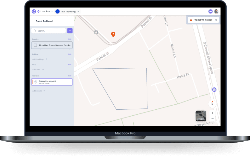
Wayloader Locations helps planners and site teams manage complex sites and geographies through clearer, contextual views.
I led discovery through high-fidelity prototypes and responsive interaction definitions, focusing on faster decisions without losing spatial context.
The problem
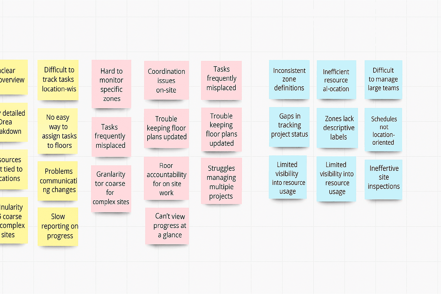
Teams struggled to understand multiple sites spatially, move between overview and detail, coordinate fragmented information and reach useful location data while on site.
The result was slower planning, missed coordination opportunities and lost context during time-sensitive work.
My role & constraints
- Led discovery and UX strategy
- Interviewed planners and site teams
- Mapped journeys and task flows
- Designed wireframes and high-fidelity UI
- Created interactive Figma prototypes
- Iterated through usability feedback with Product and Engineering
Discovery & research
I mapped Explore, Search and Plan intents, reviewed competitors and audited current search and filtering behaviour.
Three perspectives shaped the work: operations managers needing depot visibility, logistics planners building route and location stacks, and analysts comparing regional performance.
Key insights
People needed a high-level overview and rapid access to site detail.
Search behaviour was inconsistent and filters were overloaded.
There was no preview before opening a location.
Google Maps, Flexport and Descartes provided useful reference patterns for filtering, autocomplete and spatial UX.
Design approach
Intent-driven navigation
Structured the experience around Explore, Search and Plan.
Progressive disclosure
Kept the default state simple and revealed advanced controls only when needed.
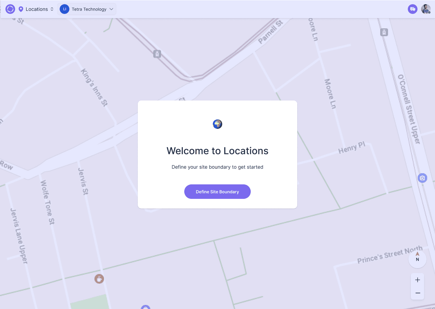
Map-first thinking
Used the map as a persistent canvas rather than a decorative view.
Reusable and modular
Designed filters and layouts to support future tools and data.
Contextual clarity
Added previews and responsive feedback to support faster decisions.
The solution
Location overview
A list or map of project locations with summary data for scanning scope and status.
Location detail
Recent updates, actions and timelines for a specific site without severing overview context.
Responsive interactions
Wide and narrow layouts preserve location awareness while people move between views.
What changed through testing
Filters were dense and difficult to scan.
Reorganised them around clearer defaults.Advanced controls dominated the experience.
Collapsed complexity behind purposeful toggles.Users lost their position when drilling down.
Added breadcrumbs, previews and a clearer hierarchy.Outcome & impact
01
Users identified and navigated between locations significantly faster in testing.
02
Greater confidence in understanding spatial relationships between sites.
03
Better planner–site coordination through clearer context.
04
Reduced cognitive load and faster decision-making across multiple sites.
Reflection
Spatial interfaces are not only maps. The real design problem was helping people retain context while moving between levels of detail.
Where I’d take it next
- Location filtering based on role or priority
- Offline location context for low-connectivity environments