Wayloader mobile · Navigation and personalisation
Plan Mobile — View Switcher
Senior Product Designer — feature lead
- Role
- Senior Product Designer
- Timeline
- 2 sprints
- Product
- Plan Mobile
- Team
- 2 designers · 5 products
Overview
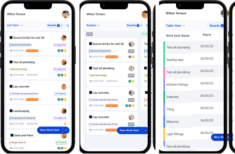
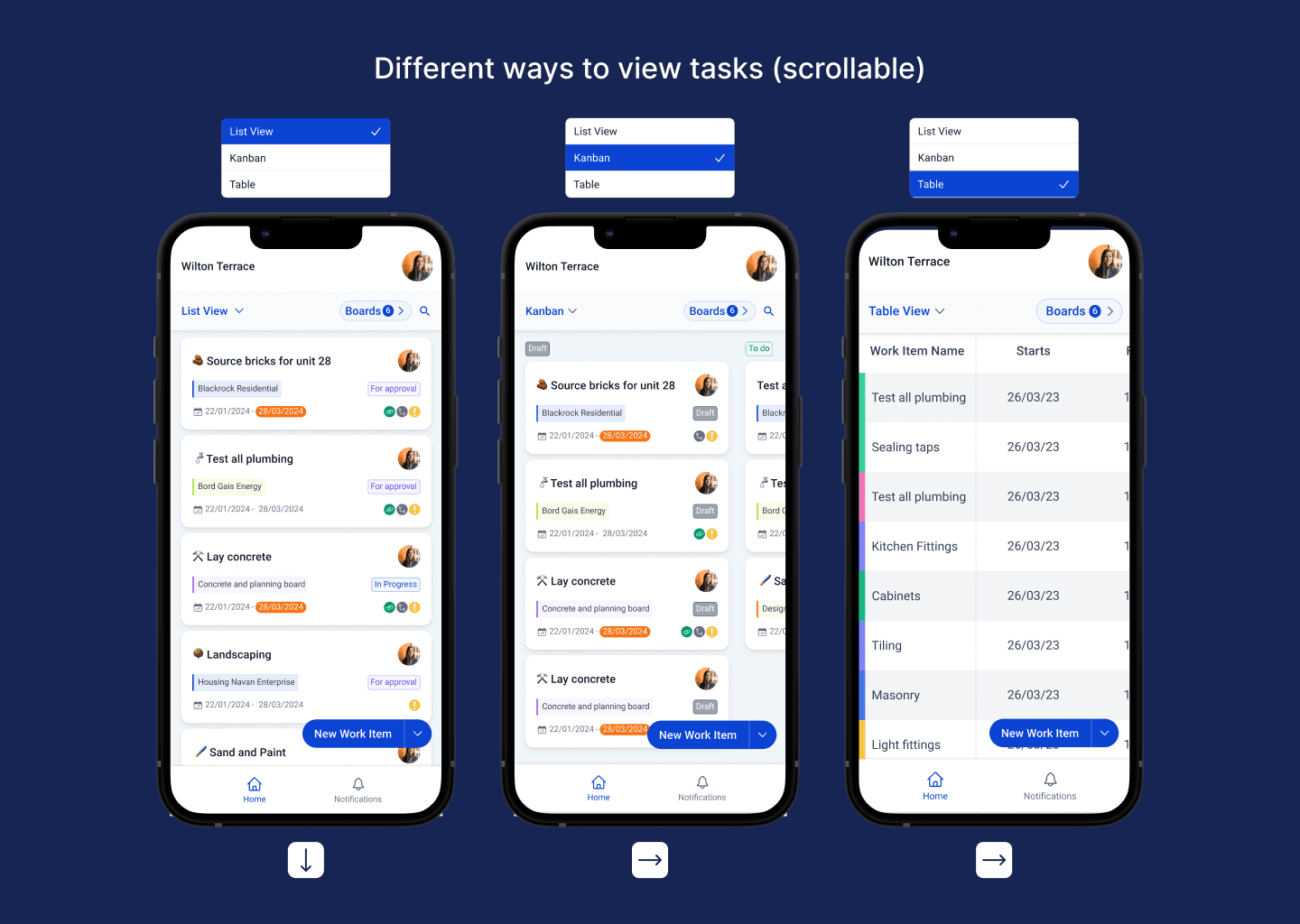
Plan Mobile originally presented every work item in one card view. This focused feature introduced multiple views so people could shape the interface around the information they needed in the moment.
I led discovery and design through a rapid two-sprint cycle, aligning user evidence with delivery constraints.
The problem
One card view made it difficult to find and compare essential task information quickly, affecting engagement and retention.
Users lost context while switching views, while desktop-oriented controls were visually buried and difficult on touch screens.
My role & constraints
- Led discovery and UX strategy
- Conducted contextual interviews
- Designed flows, wireframes and high-fidelity UI
- Built interactive Figma prototypes
- Aligned feasibility with Product and Engineering
- Iterated through testing and stakeholder feedback
Delivery constraints
Client pressure required a quick turnaround.
Two designers were supporting five products, making time and capacity tight.
Previous market research gave the team a useful head start, but current user evidence still had to shape the final design.
Tools: Google Forms · Figma · Maze
Discovery & research
I ran contextual interviews with people who frequently switched views, task analysis of common navigation patterns and a usability assessment of the previous controls.
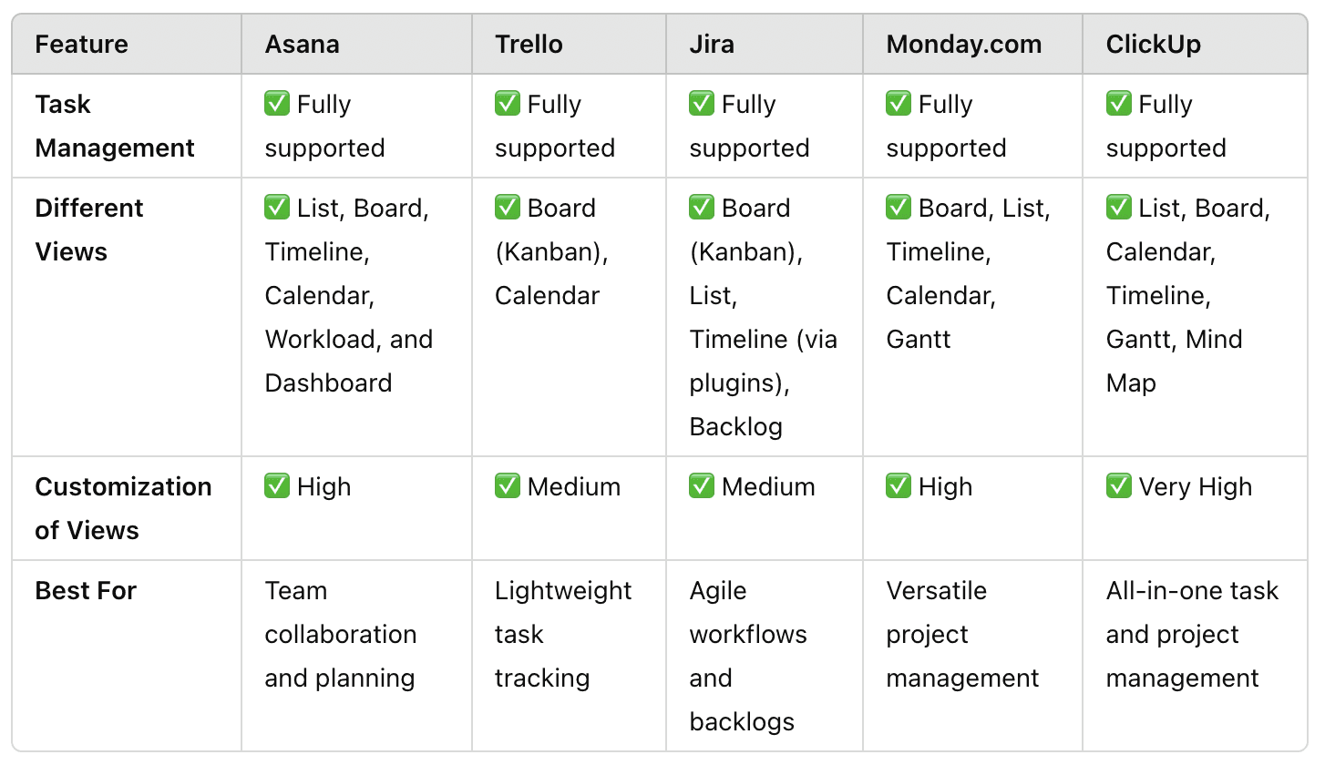
A feature-comparison chart surfaced conventions across project-management products and helped distinguish familiar mental models from opportunities to improve.
Key insights
People lost task context between views, creating error-prone workflows.
Existing controls lacked visual prominence and a clear affordance.
Touch-screen users struggled with navigation patterns inherited from desktop.
Design approach
Predictable hierarchy
Communicated the current state and available destinations immediately.
Responsive first
Used progressive enhancement so smaller screens retained functionality rather than hiding it.
Rapid validation
Tested placement, iconography and transition behaviour in interactive prototypes before finalising the UI.
The solution
View Switcher
Shows the current view, enables low-tap context switching and surfaces defaults and favourites.
Column preferences
Lets people adjust the information density of table views for the task at hand.
Interaction states
Clear selection, hover and focus states reduce disorientation, with keyboard access for power users.
Adaptive layout
The control scales from desktop to small touch screens without losing capability.
“The view switcher has been a game-changer—it lets me quickly toggle between layouts, making it easier to see task details and progress exactly how I need for the situation.”
Wayloader user
Outcome & impact
01
Users completed view toggles 30–50% faster during task flows.
02
Navigation confusion reduced substantially in testing.
03
Mobile users reported better visibility and easier context switching.
04
The feature was greenlit for development and informed navigation improvements in other modules.
Reflection
A small navigation control can carry a disproportionate amount of cognitive load. Keeping context visible mattered more than adding options.
Where I’d take it next
- Personalised default views
- Shortcut patterns for power users
- Context-aware suggestions based on usage history